
The Importance Of Designing For Neurodivergent Communities

In our recent collaboration with a client whose work centres around coaching and supporting neurodivergent individuals, we embarked on a journey to explore how to best design with their unique needs in mind. While we already have experience in accessible design and adhere to best practices, we wanted to delve deeper into the specific considerations required for designing with neurodivergent people in focus, and how these insights could be applied to enhance the inclusivity of all our design work and online spaces.
Our research has unveiled some insightful tips that we're excited to share today. These practical suggestions will help you design with a focus on meeting the unique needs of the neurodivergent community.

Example of a brand colour palette that we made for Tinies & Co.
Mindful Use of Colours
Colour is an incredibly important part of design that can help convey feelings, emotions and the overall direction of your brand or product. Normally, when creating colour palettes or using colours in a design, our main focus is making sure that all the main elements have a high enough contrast so that it’s easy to read for everyone.
However, it's interesting to note that neurodivergent individuals often prefer it when the contrast isn’t so high that it’s jarring or discordant. They typically prefer one colour in different hues, but this isn’t always possible, so a good alternative is using harmonious colours in pastel hues that contrast enough to create a beautiful design, but not so much that it can cause too much strain on the eyes or cause too many distractions. Neutral colours, like tans, bieges and greys, are also a great way to add depth to your design whilst being mindful of not making the designs overwhelming.

Example of clear brand typography from our project with On The Cake Stand.
Thoughtful Typography Choices
When considering fonts for neurodivergent audiences, it's important to prioritise legibility and clarity. Avoid fonts with elaborate serifs or intricate script styles, as these can be distracting and hinder readability.
It’s best practice to opt for simple, easy-to-read fonts that ensure your message is accessible to a wide range of individuals, including neurodiverse communities. This approach guarantees that your content is welcoming and inclusive to all readers.
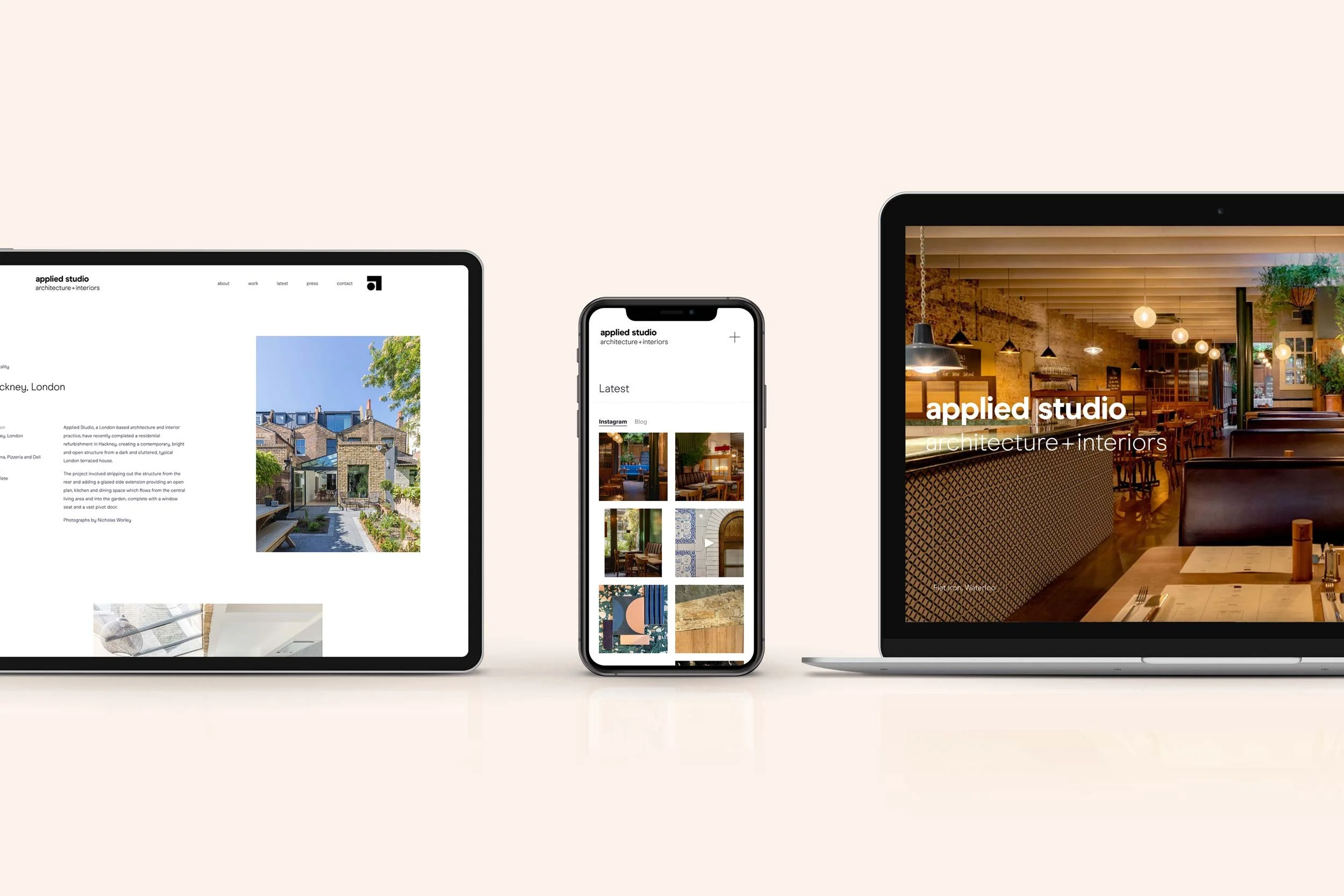
Example of clear website design from our project with Applied Studio.
Website Design and User Experience
As with any normal website, you need to make sure that you are creating a very clear and simple user journey to help the user quickly and efficiently get to where they need to go, whether that be to purchase a product, find some information, or sign up to learn more information.
It’s always best to create a fuss-free design, that focuses on one call to action or one element at a time rather than overcrowding your design. This is even more important with neurodiverse clients. Try to keep your design clean, simple and straight to the point.
Another thing that we incorporated in our design for our client, who works primarily with neurodiverse communities, was clear signposting. If you use an image on the homepage that relates to the ‘about us’ section, for example, you want to then use that image at the top of the about page to help symbolise that the user is in the right place. Simple tricks like these can make all the difference.

Examples of brand shapes we’ve used for Seekology.
Shapes and Patterns
When designing for neurodiverse communities, the use of shapes and patterns plays a crucial role in creating an inclusive and comfortable visual environment. To ensure your designs are accommodating, it's best to keep shapes simple and straightforward, avoiding overly complex or intricate patterns that can be visually overwhelming.
Consistency in shapes and patterns can help users navigate content more easily, providing a sense of predictability and structure. Additionally, the clear differentiation between sections using shapes or patterns can aid neurodivergent individuals in understanding the flow and organisation of the information. By maintaining a balance between visual interest and simplicity, designers can enhance the user experience, making their content more accessible and user-friendly for all.
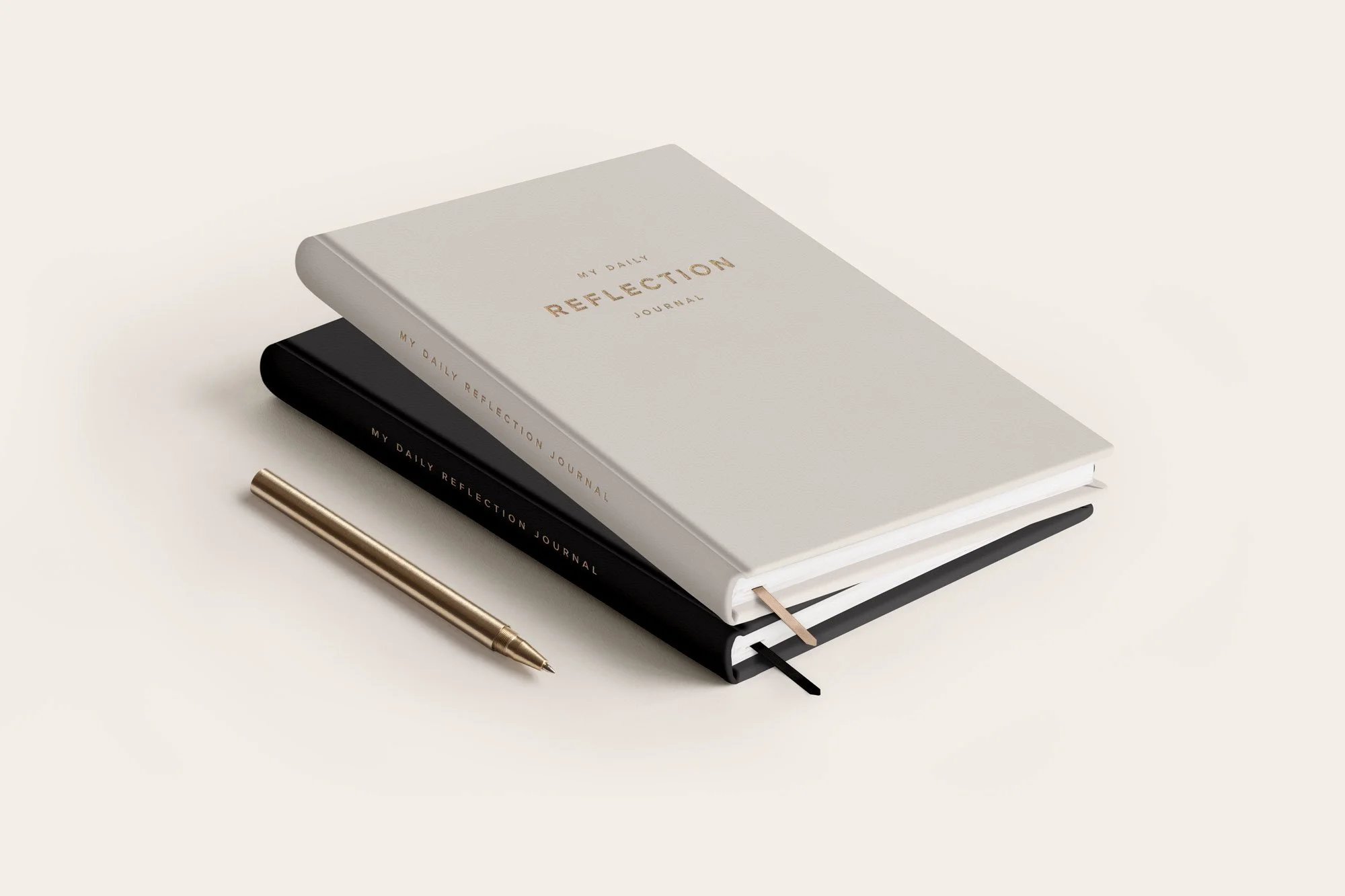
Clutter-Free Design for Mindful Champs Adult Journal.
Clutter-Free Designs
Creating a design with a clear and user-friendly flow isn’t only applicable to websites, it’s also important for printed comms and social media. By incorporating a well-defined structure into your designs, you can greatly enhance the accessibility and comprehensibility of the content.
Start by establishing a logical hierarchy within your design. This hierarchy helps users discern the order of information and understand its relative importance. You can use techniques such as varying font sizes, distinct headings, or strategic use of colour to distinguish different levels of content.
As we mentioned before, consider using consistent visual cues or graphical elements that signal transitions or changes. For example, employing clear dividers, borders, or white space between sections helps individuals with neurodivergent conditions navigate through your content more easily. These visual cues act as guideposts, indicating shifts in topics or content, which can reduce cognitive load and improve comprehension.
Avoid clutter and maintain a clean and organised structure, ensuring that content is well-spaced and logically arranged. It's beneficial to minimise distractions and ensure that the user's focus remains on the core information. Making content transitions and changes easily discernible facilitates a more straightforward and enjoyable experience for all users.
Making Your Designs Better For All
If you are concerned about whether your website is fully compliant with all accessibility laws, then we’d recommend that you have a look at AccessiBe as it’s an amazing tool that helps to make the internet an accessible and inclusive space. Hundreds of millions of websites are inaccessible and keep people with disabilities disconnected. And AccessiBe changes that.
If you want to learn more about AccessiBe, then feel free to send us a message, and we will install it on your site free of charge, you just need to message us, and we can set you up with an account!
Designing with a focus on neurodiversity promotes inclusivity and results in more user-friendly and universally appealing creations. By implementing these tips and considering the specific needs of the neurodivergent community, designers can foster a more inclusive and welcoming environment for everyone, regardless of their cognitive or sensory profiles.
Embracing these principles enriches the world of design with diversity and accessibility, ensuring that no one is left behind in the digital world.