
7 Quick Tips for Great Dashboard Design
Dashboards are a great way to display a lot of information to a user without overwhelming them - assuming the design is well thought through of course.
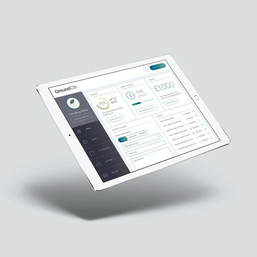
We've been working on a fair few dashboards here at Studio 77 recently, and thought we'd compile a few tips and tricks on how we think dashboard design should be done.
01 - What Is The Purpose?
What is the primary goal of this dashboard? Write this down on a post it note, stick it to your computer. Look at it on a regular basis. Simple.
02 - Keep It As Simple As Possible
Are you adding in unnecessary pieces of information just because it will make the dashboard look cool? Yeah, we've been there too. Dashboards are complex, and users can be easily confused - what is clear to us, isn't always clear to them. Strip back the dashboard to only have the essential information.
03 - Establish a Hierarchy
The navigation is a fundamental element of the dashboard, so needs to be as clear as possible. In order to wireframe and design a successful dashboard navigation you need to establish a hierarchy early on. If the navigation is wrong, the rest of the design will be confusing for the user and you've fallen at the first hurdle.
04 - Research
As with most product design, it's really important to do some research before starting a dashboard. We always put together a Pinterest board and send it to the client before we do anything - this way we can judge their responses to UX and designs before we even put the mouse to the Sketch board.
05 - Don't Re-invent the Wheel
Sometimes we're so keen to do something new and innovative, it's easy to forget that sometimes, just sometimes, things are done in a certain way for a reason. I will say no more.
06 - Always, always, always wireframe first
We wrote always three times so you know this one is important. Sometimes it's so tempting to get excited and start designing something before the wireframe has been approved, but don't do it! 90% of the time, clients will chop and change things and ultimately you will end up wasting your time.
07 - Use InVision
Clients can find it hard to visualise how a dashboard will work in a pdf. We always use InVision to showcase a dashboard / website / app - this allows you to quickly and easily prototype the navigation and the user experience.