
signature brand + web package
Lady Freethinker signature branding and website design
Lady Freethinker is an animal rights non-profit based in the US who are dedicated to creating a world without cruelty. Our job was to create a new brand identity and website design for these global change makers.
Project objectives
Before starting our project with Lady Freethinker, we did some in-depth customer research to uncover the brand strategy required to make the project a success. Through the brand strategy, we discovered that we needed to shout about the success stories and positive change that LFT has made, as this will inspire others to sign petitions, donate and get involved.


“We LOVE the logo and web design that Ruby created for our nonprofit organization. The care, time and talent that went into the work exceeded our expectations. Thank you!”
nina jackel, lady freethinker

Our brand design approach
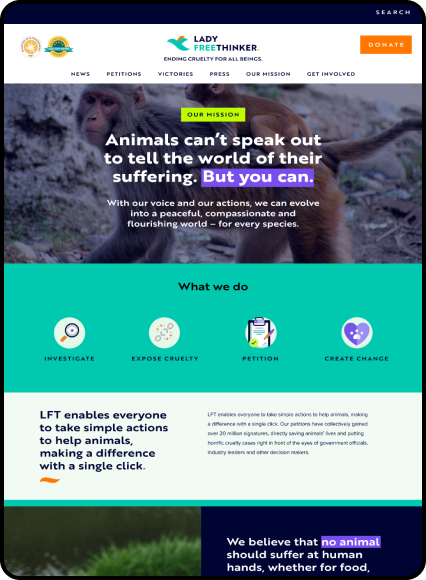
We needed to create a versatile brand that worked well for audiences of all agencies, primarily between the 25 - 55 group. Our aim was to create a bright and bold brand to convey the bold, unafraid, passionate energy that their underlining brand message has.
We ensured that what we were doing was different to other animal rights non-profits, as a lot of the bigger brands felt a little dated. In short, we needed to make Lady Freethinker look like the change makers that they are.
The logo design
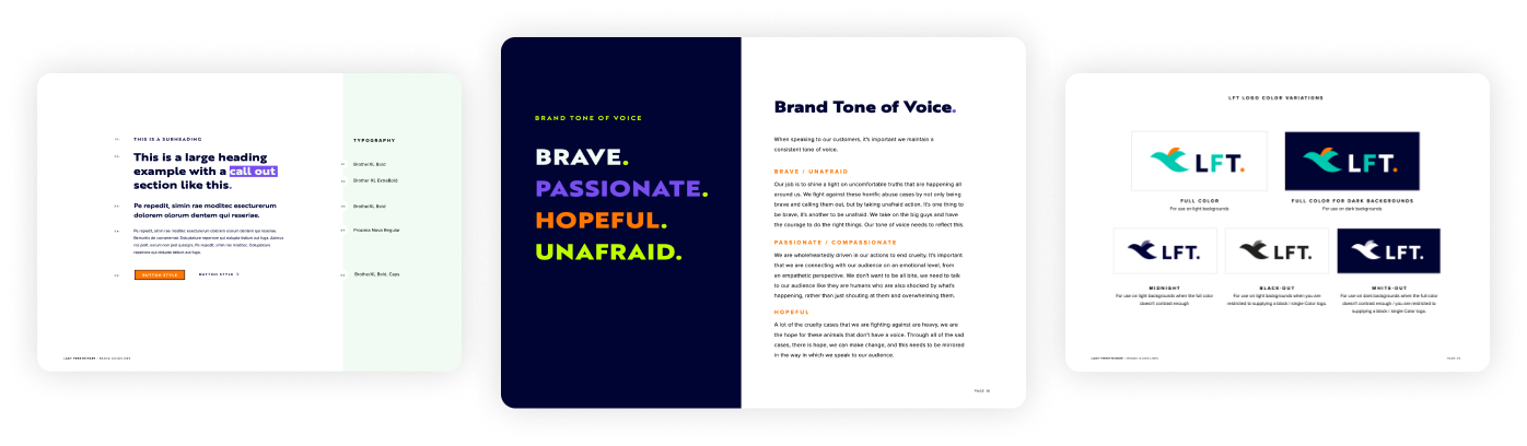
The Lady Freethinker logo was created around an abstract bird mark that symbolises freedom. The shapes used are fluid to represent movement, and the wing of the bird could also represent a leaf or a flame. The leaf reflects the nature aspect of the brand, and the fire showcases the passion that LFT ignites in its supporters.
With freedom being one of the key aspects of the brand, 'Free' is in a different colour. This also helps to introduce other brand colours and build a sense of familiarity with the brand from just the logo. The full stop at the end of the logo signifies the message behind the brand to end abuse. This feels final and authoritative and is an element that we have introduced into other parts of the brand.


Brand colour palette
The work that Lady Freethinker does is bold, impactful and compassionate, so it was important that we mirrored that within our colour palette.
We needed to have colours that have a seriousness within the palette that we can use when talking about sensitive and severe information, as well as bold, unafraid colours that would pack an impactful punch where needed, and appeal to the younger demographic they are trying to attract.
The colours that we have used have also been through our Triple-A accessibility standards to ensure that the brand is inclusive. Our brand guidelines for Lady Freethinker included WCAG 2.0. accessibility guidelines to let the team know which colours can be used on top of each other to meet Triple-A accessibility standards.


Typography for animal rights non-profit brand, Lady Freethinker
We wanted to go with a bold and brave font that was easy to read. It was important that we choose a font without too much personality as a lot of the content that LFT highlights is very severe, so we needed to maintain a level of seriousness within the typography where needed.
We introduced a highlighted background colour that can be used on certain words so that the text packs a certain punch in places. We also mirror the logo, where appropriate by ending sentences with a different colour period to symbolise the end of animal suffering. A subtle, but sophisticated way to enforce your brand mission.
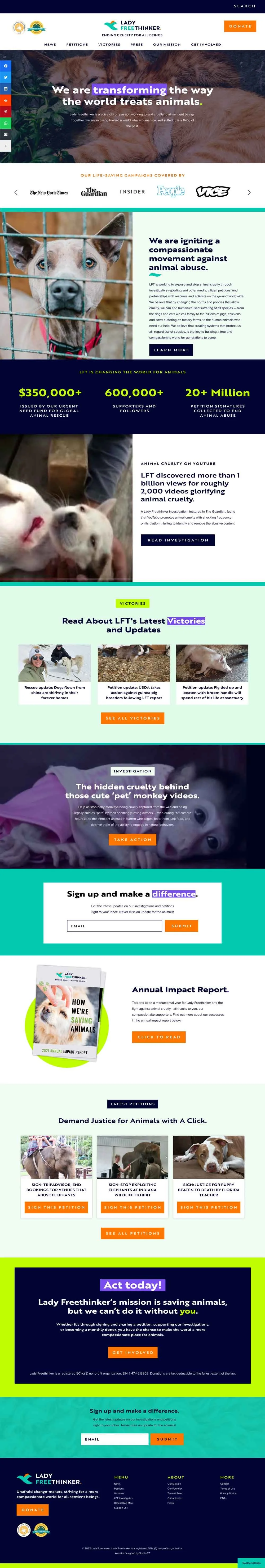
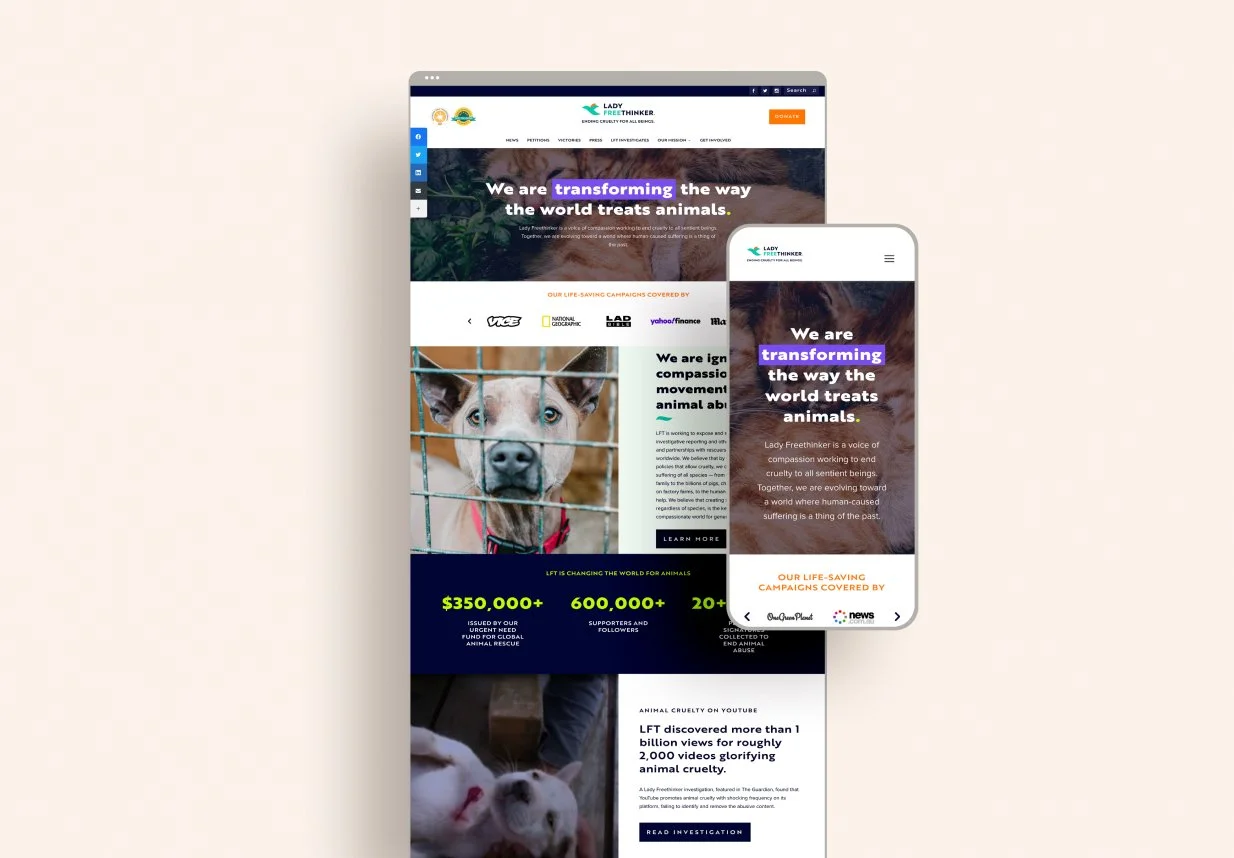
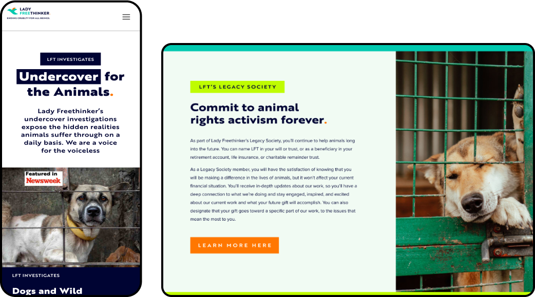
Bespoke WordPress website design
The aim of the Lady Freethinker website was to both highlight the amazing changes that the non-profit is making, as well as highlight the serious work that still needs to happen.
During our strategy sessions, we uncovered there were three types of users of the site: long-term supporters of LFT, a new younger audience that were wanting to get involved and reporters who wanted to get the scoop on the latest LFT investigations.
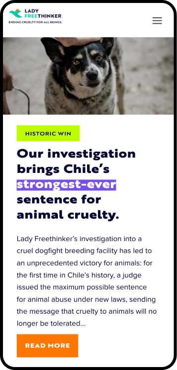
Highlighting Lady Freethinker’s victories
A lot of the content on the previous LFT WordPress website was focused on the change that still needs to happen, whilst this is an incredibly important thing to highlight, we wanted to shift the focus onto the incredible changes and victories that the LFT community has already had.
On the homepage, across the site, and on the ‘Victories’ page, we made sure to draw attention to the wins, as this helps the existing, and future, supporters to see how they can make a change by getting involved.
Educating users on how they can help
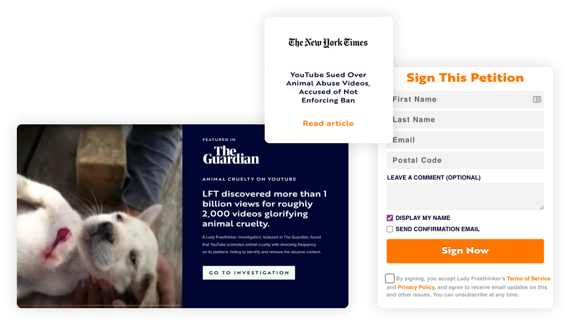
The most important aim of the new WordPress website, was to encourage more donations, and more petition signatures. To achieve this, we’ve added a bold ‘donate’ button in the top right of every page, and added multiple ‘sign the petition’ buttons across the site.
Rather than just placing call to actions every where, we’ve made sure that each ‘sign the petition’ button is next to a compelling story to encourage users to feel motivated to take action and make a difference.
WordPress Training
We teach all of our clients how to use and update their WordPress website with our bespoke video training at the end of the project, all of our clients say how easy it is for them to update their website after the training.
We also offer WordPress maintenance packages for those who need additional help with their site.
Your dream charity brand and website design is just a Zoom call away.
If you're interested in creating a magic, memorable and money-making website and brand, get in touch with one of our team today.