
branding package
Seekology branding and Shopify website design
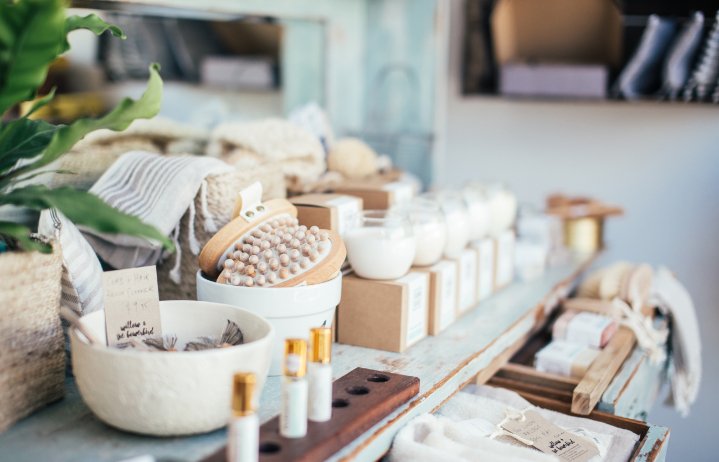
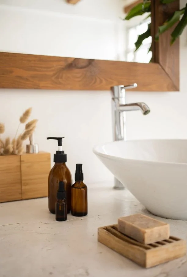
Seekology founder Rebecca Saunders wants to shine a light on unique brands and products in the beauty and wellbeing sectors, and wants to rejuvenate the high street by focusing on an inspiration, education and the ‘discovery way’ of shopping.

Project objectives
We were excited to work with Seekology to create a beauty and wellbeing brand that both stood out from her competitors, and felt inviting to the target audience.
As with every branding project, we started by deep diving into Rebecca’s mission for the brand, as well as working through our signature brand persona exercise to uncover what would speak to the market best.
“Studio 77 did a fantastic job, were super organised, really understood the creative brief and delivered high-quality materials. I'd highly recommend Ruby and her team.”
rebecca saunders, founder of seekology

Our brand design approach
With Seekology’s brand design, we wanted to explore ways to communicate the ‘discovery’ way of shopping that Rebecca wanted to promote.
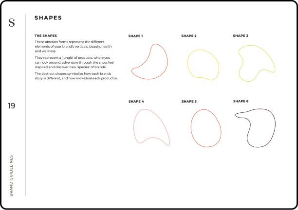
We included abstract forms in the Seekology brand, with each shape representing the different elements of the brand’s verticals: beauty, health, and wellness.
They represent a ‘jungle’ of products, where you can look around, adventure through the shop, feel inspired and discover new ‘species’ of brands. The abstract shapes symbolise how each brands story is different, and how individual each product is.
The logo design
Creating a logo that worked well with other brands was a fundamental aspect of the logo design, so we went with a wordmark as opposed to a symbol logo. The typography used is heavy enough to be easy to read but light enough to carry an air of elegance. The logo hosts classic serifed font features, however, the descenders on the ‘g’ and the ‘y’ are more playful and friendly than your standard font, and the roundness on the ‘e’ and ‘o’ create a welcoming, familiar feeling.


Fresh and organic brand colour palette.
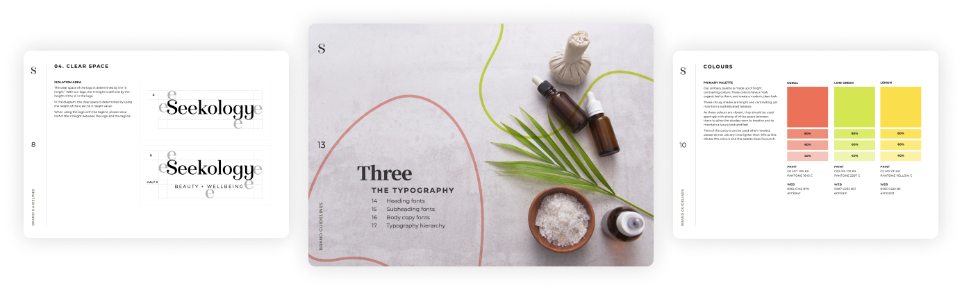
The primary colour palette is made up of bright, contrasting colours. These colours have a fresh, organic feel to them, and create a modern, clean look. These citrusy shades are bright and contrasting, yet maintain a sophisticated balance. As these colours are vibrant, in the brand guidelines we outlined that they should be used sparingly with plenty of white space between them to allow the shades room to breathe and to maintain a luxury look and feel.
Supporting the primary colours are some complementary tones. The aubergine roots the palette, while the pink adds a harmonious feel.

Brand typography for health and wellness retail brand, Seekology
When selecting typography, we chose a sophisticated serif font that was both clear and easy to read, while it’s angled serifs and varied stroke weights conveys a refined, mature feel. For subtitles and smaller body copy, we chose a sans serif font, the contrast between the larger serifed headings and the simpler sans serif creates a pleasant visual hierarchy. Both fonts we selected have similarly rounded bowls (the ‘O’ shape) which make them sit together harmoniously
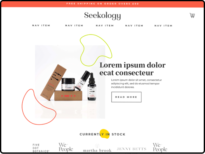
Shopify website design mockups
Once the brand design was complete, it was important that it translated well onto their Shopify website, so we created some website design mockups for their Shopify development team to work from when it came to the website, advising them on how to best apply the brand onto digtal designs.
Your dream beauty brand and website design is just a Zoom call away.
If you have a one-of-a-kind business and you’re looking for a brand and website to match, we’re here for you! Get in touch with our expert design team today, and let’s start your creative journey together.