
3 Website Design Tips From Our Free Website Reviews on Instagram Live
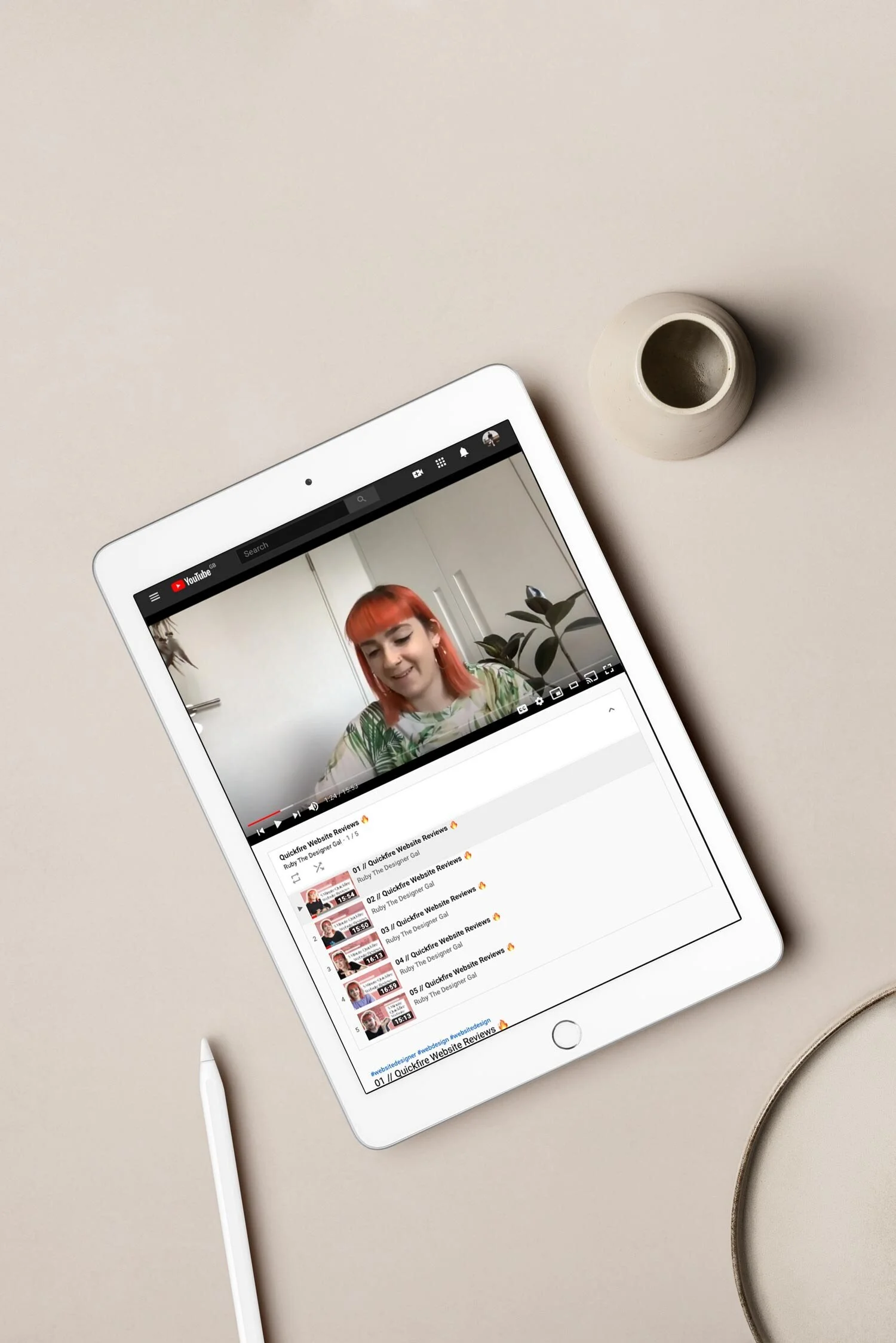
A couple of weeks ago, I went live on Instagram every day at 7pm to do some quickfire website reviews, and when I say quick reviews, I mean a five-minute glance over some website designs. With every business trading digitally at the moment, I wanted to be able to give back to the small business community, and dish out some actionable advice that small business owners can implement on their websites themselves.
After reviewing 15 websites back to back, there were some common themes across the things that I was seeing, so I've collated a list of the top 3 points that everyone should be doing on their website.
Make sure what you do or sell is instantly clear as soon as you land on your website
Being creative with your website is a great thing to do, your website is your digital footprint so you want to showcase your personality. But your personality is rendered confusing if you don’t clearly state what service you offer or what product you're selling.
Users have a really short attention span, and if they don’t understand what it is that you can offer them, then they will likely bounce right off your website feeling confused and frustrated.
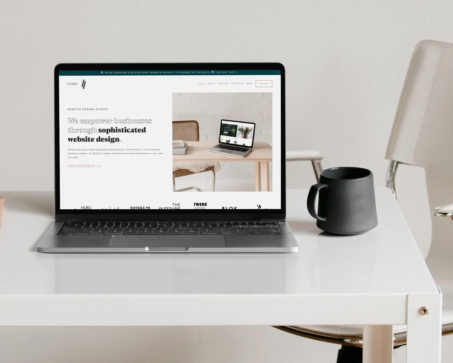
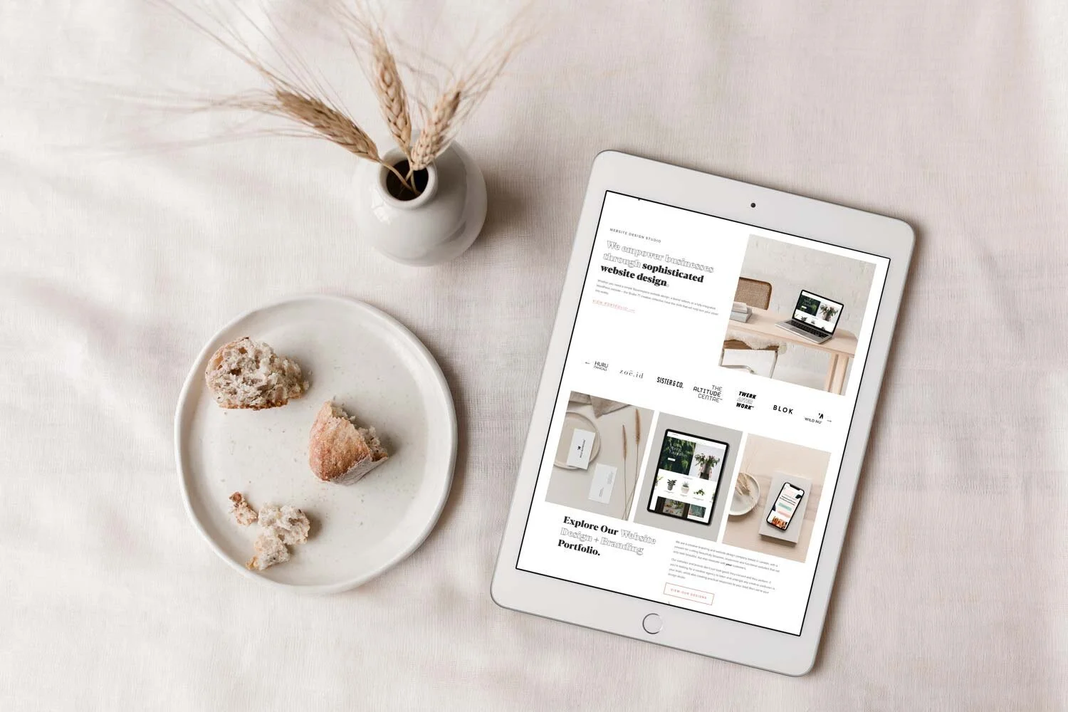
Use the top section of your homepage to tell users your offerings, for example on our website we say ‘we empower businesses through sophisticated website design’ - this allows our users to instantly know what it is that we offer.
Now we offer other services as well, but we’re just focusing on our main, core offering on the header of the website as we know how important it is the grab the attention of the user as quickly as possible. We support this statement with a photo of one of our website designs in a laptop, so use photography as a supporting element in the header of the website if it’s relevant for your business.

Have photos of yourself / the team on the website
I know, showing pictures of yourself can be scary, but people buy from people! In the digital age (and at the time of writing this post, the pandemic age…), you can’t always physically be there to meet your customers and guide them through the website and build that relationship.
If you're a service business or a solo entrepreneur, users will be buying your time, and your knowledge, so they're going to want to feel like they know you a little bit before they part with their time or money.
By having your photo on your website, it helps personalise the experience and makes the users trust you as they can see you and your friendly face. It’s a great way for planting the seed for a video meeting or in-person meeting, as you're taking away the barrier of 'I don't know who I'll be working with.'
Be consistent with your fonts and colours
This is probably the number one thing that I see amongst non-designers when they design websites (or anything) for their brands. When your visuals aren’t consistent, they look messy! And when things look messy, it’s breaks trust with your customer.
You wouldn’t turn up to an interview with messy hair and t-shirt with some of last nights dinner stained on it! Treat your website as though it were one of your employees, it represents your business when you're not able to be there in person to do so.
Squarespace is great for keeping your designs consistent as you can set up your font styles and your colour palette, and then you can easily apply those throughout your website.
If you want to have a browse through the 15 websites that I reviewed a couple of weeks ago, then head over to my Ruby The Designer Gal YouTube channel to find out some more great tips for keeping your website design on point!